CASE STUDY
Designing a Mobile Claims Experience for an Enterprise Benefits Platform
Role: Product Manager
Company: Enterprise Benefits Platform (Anonymized)
Platform: iOS & Android
Timeframe: Multi-year iterative ownership
Overview
This mobile application that allows employees to submit health and lifestyle spending claims by photographing receipts, tracking claim status, and managing benefit information directly from their phone.
I served as the Product Manager responsible for iterating and modernizing the mobile app over multiple years, guiding feature development, UX improvements, and security enhancements while balancing regulatory constraints and enterprise stakeholder needs.
My focus was not a one-time redesign, but continuous product evolution — improving clarity, trust, and usability as the platform expanded.
The Problem
While the mobile app delivered core functionality early on, the experience showed several limitations over time:
-
-
Visual design no longer matched user expectations for modern mobile apps.
-
Critical actions (submit, track, edit) were not clearly prioritized
-
Claims data was dense and difficult to scan on mobile
-
The app lacked parity with web features (e.g., dependent management)
-
Security expectations increased without equivalent UX updates
-
As adoption grew, these issues impacted user confidence, efficiency, and long-term scalability.
The Challenge
The challenge was not a one-time redesign, but evolving a live mobile product used daily by employees submitting real benefit claims.
The app needed to improve usability, clarity, and trust without disrupting active users, adjudication workflows, or regulated financial processes.
Constraints included:
-
Maintaining uninterrupted service for enterprise clients
-
Designing within existing backend and adjudication rules
-
Introducing modern UX patterns without increasing error rates
-
Meeting rising security and compliance expectations
Every change needed to balance user experience improvements with operational and regulatory risk.
Solution Overview
We incrementally redesigned the mobile app to feel modern, intuitive, and trustworthy — while preserving the reliability required for a regulated benefits platform.
The solution focused on:
-
-
A redesigned home dashboard
-
Clear submission and claim-tracking workflows.
-
Expanded self-service features
-
Improved feedback and system status visibility
-
Security enhancements aligned with enterprise standards
-
Key Improvements & Decisions
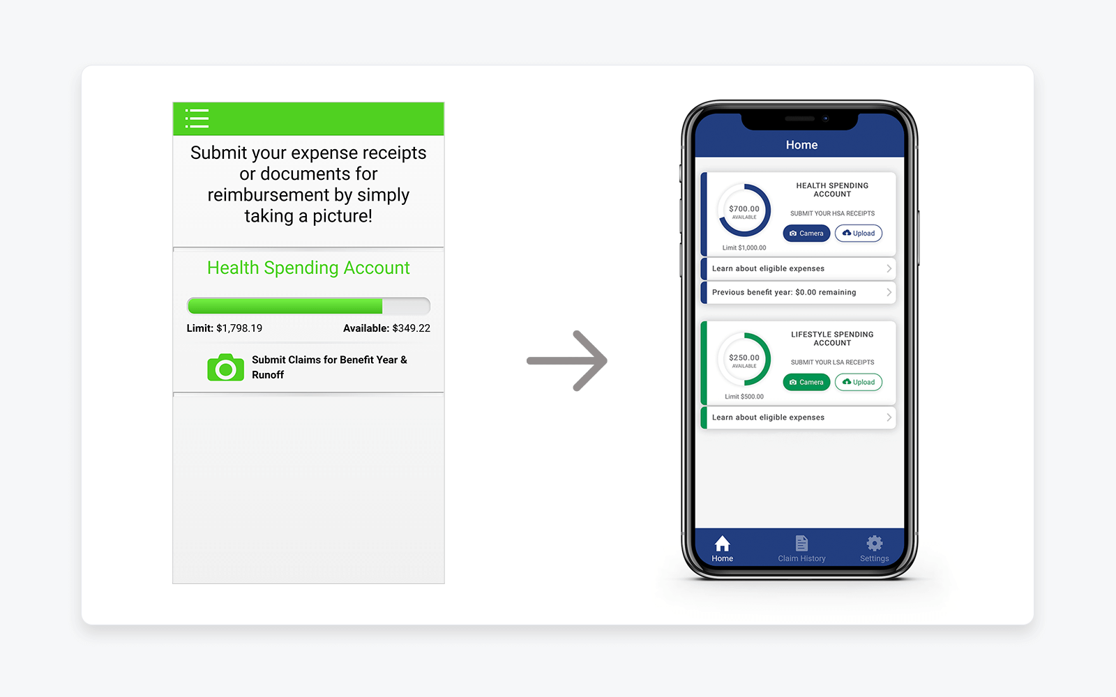
1. Redesigned Home Dashboard
The home screen was restructured to surface what matters most at a glance:
-
-
Available balances
-
Clear call-to-action buttons
-
Visual separation between account types
-
We transitioned from a dense, utilitarian layout to a cleaner, card-based design system:
-
-
Improved spacing and typography
-
Stronger visual grouping
-
Consistent component patterns across the app
-
This comparison clearly demonstrates how UX maturity evolved alongside product complexity.
Visual: Early Flex allocation concept outside the legacy platform
Purpose: Demonstrates UX modernization, improved information hierarchy, and clearer prioritization of core user actions
2. Streamlined Claim Submission Flow
Claim submission is the core value of the mobile app. I prioritized:
-
-
Fast access to camera/upload
-
Simple image capture and confirmation
-
Clear success feedback after submission
-
This reduced uncertainty and reinforced trust that claims were successfully received.
3. Clear Claim Tracking & Status Visibility
We redesigned claim history and detail views to:
-
-
Make status immediately visible
-
Improve scannability for multiple claims
-
Reduce ambiguity around approvals and next steps
-
This helped users self-serve instead of contacting support.
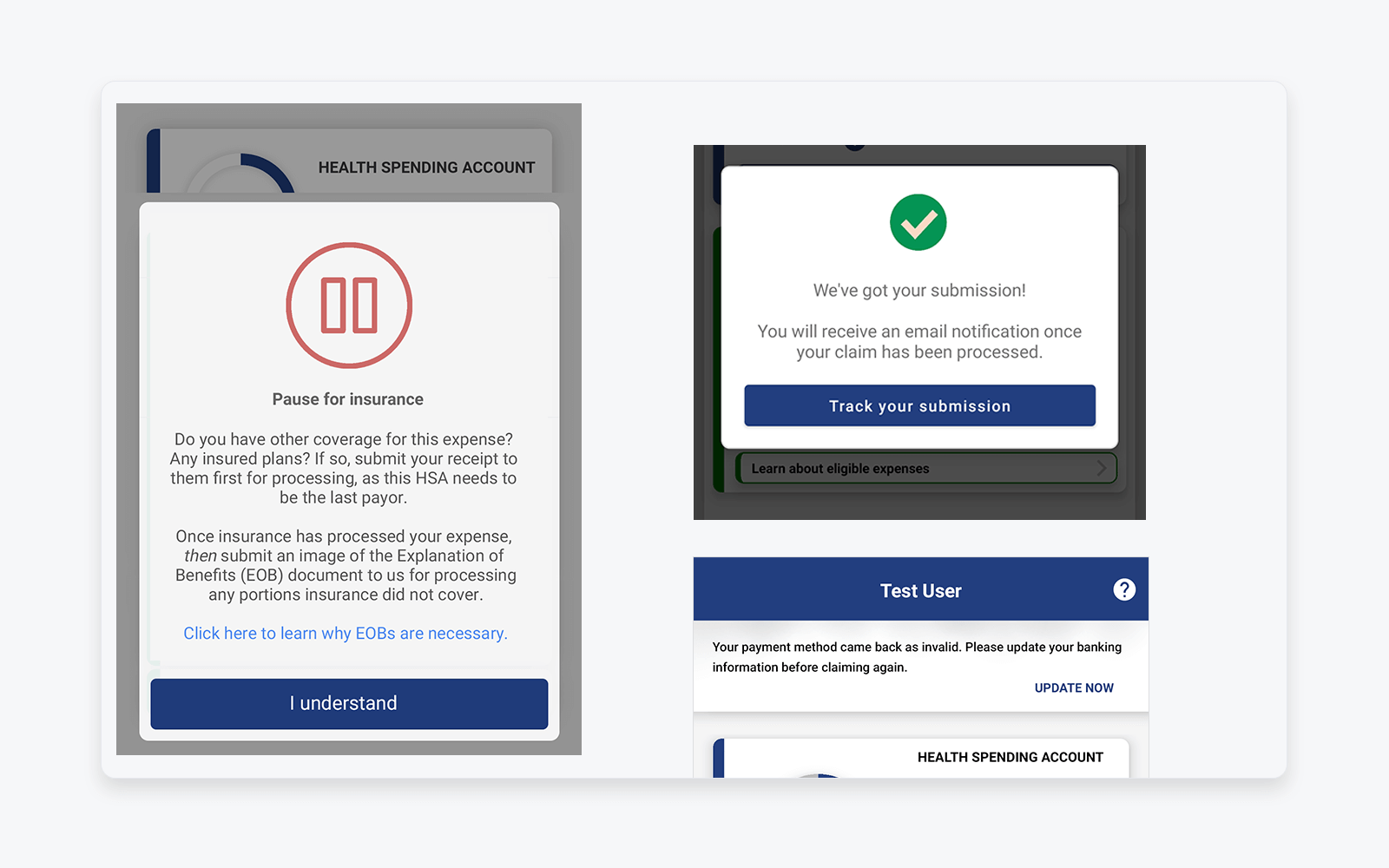
4. Submission Confirmation & Feedback
Users needed reassurance after submitting sensitive documents. We introduced clear confirmation messaging to reinforce system trust and reduce repeat submissions.
Visual: Claim submission feedback and system status messaging
Purpose: Reinforces user trust through clear confirmation, next-step guidance, and transparent system feedback after sensitive actions
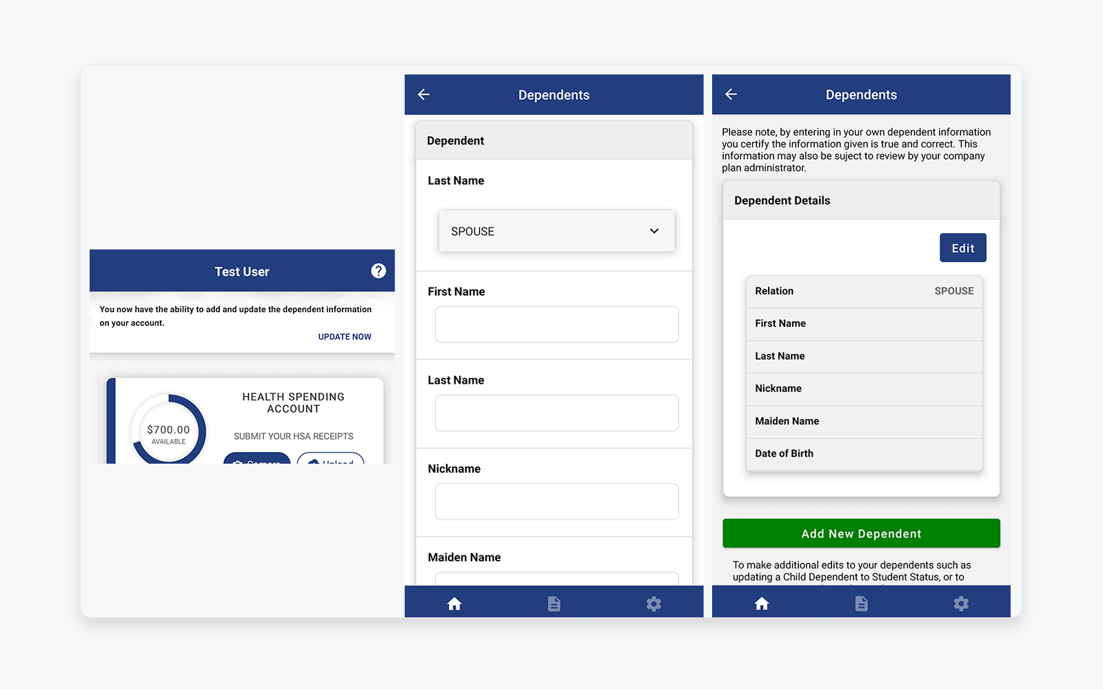
5. Expanding Mobile Feature Parity: Dependents
One major capability gap was dependent management, which previously required desktop access.
I led the rollout of dependent self-service on mobile:
-
-
Adding dependents
-
Viewing and editing dependent details
-
Clear validation and confirmation states
-
This meaningfully reduced friction for families and HR administrators.
Visual: Mobile dependent self-service (add, view, edit)
Purpose: Highlights expansion of mobile feature parity and reduction of reliance on desktop portals for high-friction tasks
6. Security & Compliance Enhancements
As security expectations increased, we introduced two-factor authentication while maintaining usability and minimizing friction.
This was a critical step in aligning the mobile experience with enterprise and regulatory standards.
Outcomes & Impact
While specific metrics are confidential, the improvements led to:
-
-
Increased confidence in mobile claim submission
-
Reduced user confusion and support dependency
-
Expanded mobile adoption as feature parity improved
-
A more scalable foundation for future enhancements
-
Most importantly, the mobile app evolved from a basic utility into a trusted, primary interaction point for benefits management.
What This Case Study Demonstrates
-
-
Long-term product ownership, not one-off delivery
-
Strong UX judgment within regulated constraints
-
Ability to balance enterprise needs with end-user experience
-
Comfort operating across design, engineering, security, and compliance
-
Incremental, outcome-driven product thinking
-
Confidentiality Note
Screens and data shown are anonymized and representative.
Company name, user information, and financial details have been modified to protect confidentiality.


